Monday, March 17th, 2025
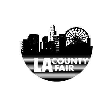
The logo works because it makes use of its limited resources to say something bold. It conveys the urgency of a punk collage, while demonstrating an economy of expression–writing bold letters in white using thin black ink lines. Broad strokes rise upward revealing a familiar skyline, and surprisingly a Ferris wheel. The harmony in the texture of the bitmaps with the rest of the design is no accident. The rhythm of the grid lines established in the lower hemisphere is repeated in the upper. The spacing lines up, satisfying the eye. The result is easy readability as both text and picture.