Wednesday, December 24th, 2025
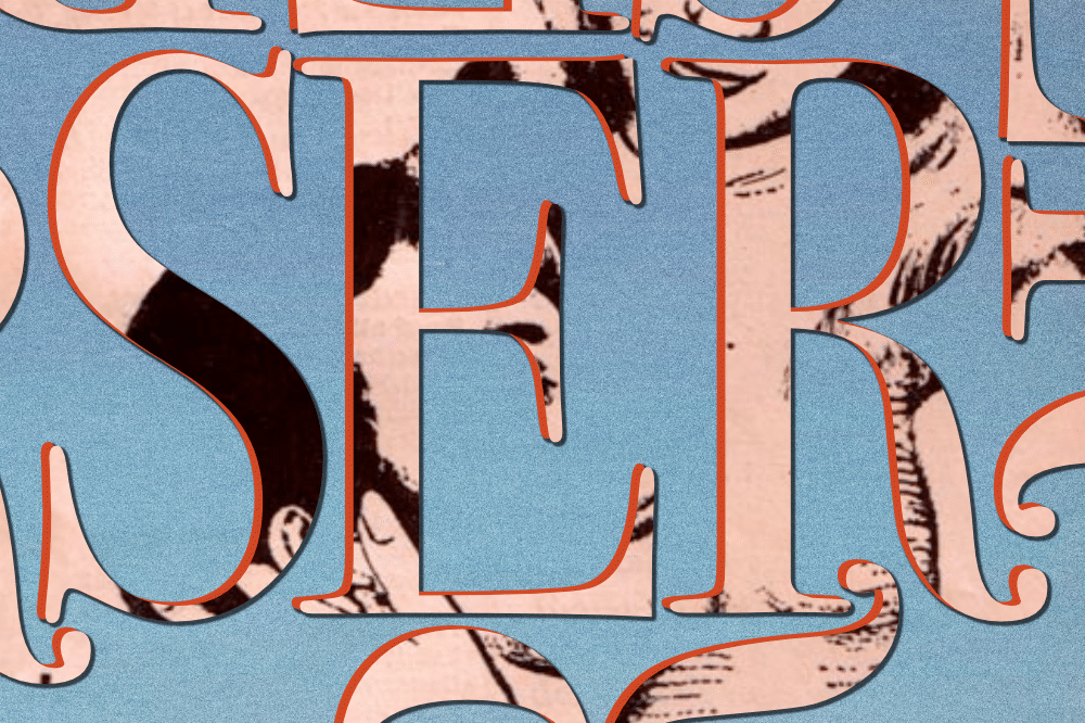
 Digital painted lettering. Base font is Impact. Two layers, different color. Draw guidelines. Mask upper layer using the guides.
Digital painted lettering. Base font is Impact. Two layers, different color. Draw guidelines. Mask upper layer using the guides.
A few years ago I was at the pink thrift store across the street from Sony Studios in Culver City (now closed). And I found a faux-leather spring binder. I instantly knew this device could help save a lot of money on sketchbooks. They don’t seem to be common in the USA but are in Europe.
Well, some fiend broke into my car and stole my prized spring binder, and it took a while to find another one . They usually come in international paper sizes like A4, A5, etc. Which is fine if you can take a 8.5″x14″ legal size paper and fold in half–that fits into an A5.
But I’m glad to say I found a seller that has 8.5″x11″, and 9″x12″ for the Americans.
If you are a sketchbook user, you know those bound books cost, and some of the contents don’t need to be preserved forever. The cool thing about a spring binder is that you can remove any page you want and preserve the “bound” status of the rest of the book– or include unusual paper colors and textures. Its a lot more functional, practical, and pragmatic than a book that is static once it is filled.
Spring binder. Get one.

![]()
A wise teacher once advised their design students never to become one’s own client. Indecision would make the project impossible.
I submit the “oh ok” logo as an example of my overcoming the challenge of indecision. I designed it for myself and committed to a finished mark that hasn’t changed in over a decade. I’m pleased with how well the design has held up over time.
How did you do it?
By taking time. The logo began as a very rough hand drawing. I intentionally avoided the predictable mental drive to endlessly perfect my own logo. One useful practice was hand writing the letters in various styles and configurations. The hand written lettering led to a concept that is calligraphic yet mechanical, refined in digital vector. Use of repetition in line angles creates the optical illusion of perspective which can change directions using the mind switch. I have more recently begun to appreciate the appearance of the words “oh ok” as a single character with it’s own recognizable shape.
To further condense the technique described: it’s about discovering patience and experimentation.
![]()
Custom lettering for residential brand mark
I have a history of working in marketing for real estate and multi-family residence development. As a copy and graphics editor I didn’t always care much about the product–I cared how the ads looked. But along the way I learned a few principles from the brand building side that I have carried with me.
One of those is that lettering is among the most powerful ways to build a sense of community, making use of the shared meaning of symbols within cultures.
With that revealed I can add the conclusion that there is no right or wrong set of symbols to use addressing potential members of a community. Choosing the right message depends on innumerable geographic and demographic considerations. When those have been made, the creative task is to produce the fine elements that lead instantly to the idea.
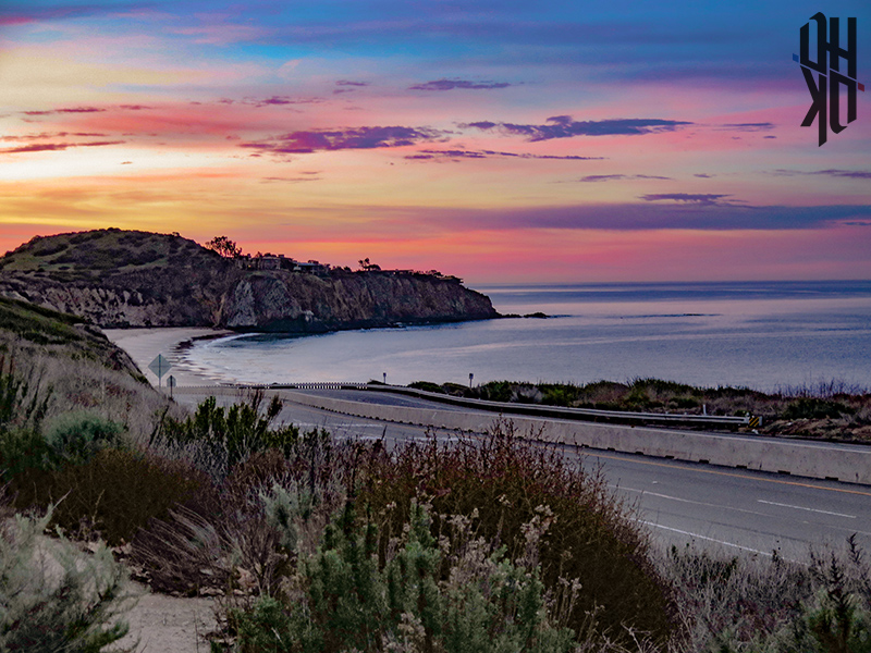
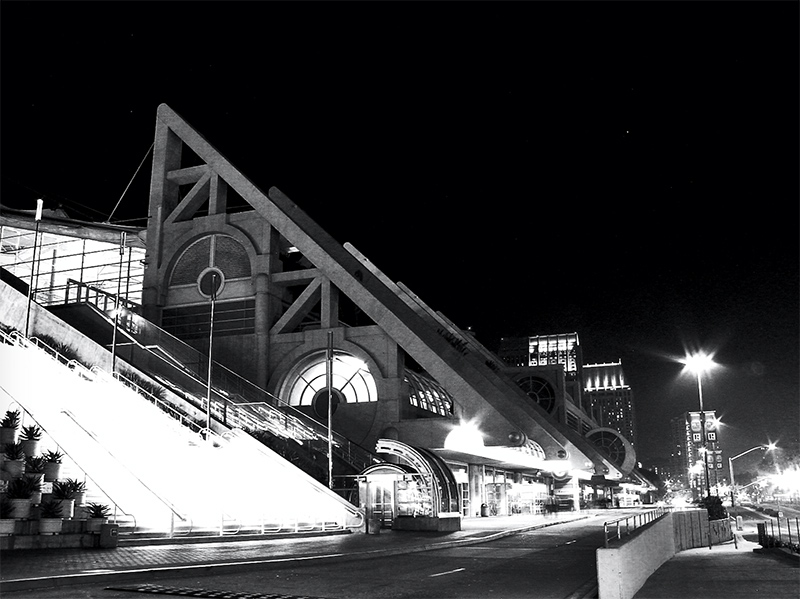 A wide aperture and slow shutter at night in San Diego.
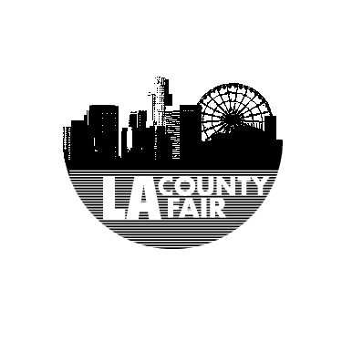
The logo works because it makes use of its limited resources to say something bold. It conveys the urgency of a punk collage, while demonstrating an economy of expression–writing bold letters in white using thin black ink lines. Broad strokes rise upward revealing a familiar skyline, and surprisingly a Ferris wheel. The harmony in the texture of the bitmaps with the rest of the design is no accident. The rhythm of the grid lines established in the lower hemisphere is repeated in the upper. The spacing lines up, satisfying the eye. The result is easy readability as both text and picture.
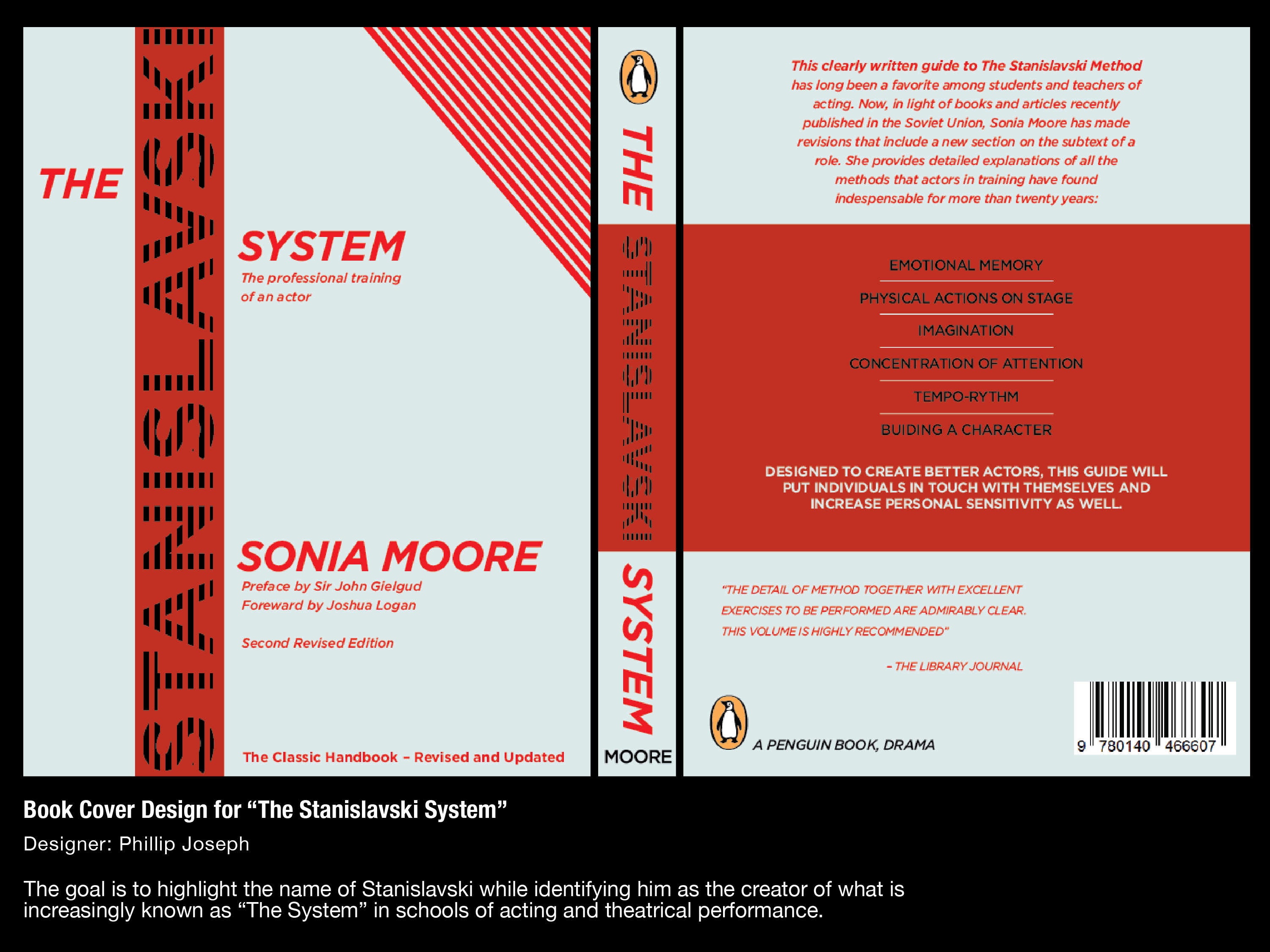
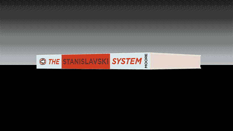
Each textual and graphic element contributes to an understanding and expectation of what’s inside. The concept is further sold with a 3D demo built in blender.
This cover design calls back to the striped covers of plays published by the Dramatist’s Play Service Inc.