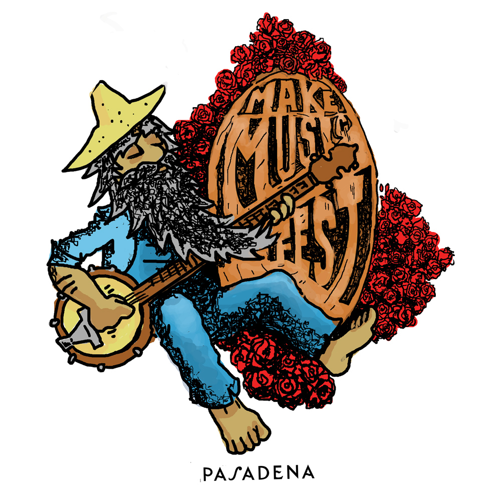
At one point I was moved to re-design marketing and promotion work for entities that I felt deserved better treatment. One such instance was the “Make Music Festival” in Pasadena in 2015. No offense, but even then it was clear that official treatments like the one below were lacking in effort and imagination.

The vibe I would want to contribute to a local California music festival: Something historic, psychedelic, and whimsical. Above all it should be musical. I had adopted the practice of gathering images for what was called in the not-distant past a “mood board”, where you establish a mood to draw from using references. The prevailing images I held in mind were these:
The Grateful Dead’s “skull and roses” logo by Stanley “Mouse” Miller and Alton Kelley.

And this artwork representing the Ancient and Honorable Order of E Clampus Vitas.

The Dead and The Clampers are humorous and I wanted my submission to carry some humor as well.
How did you do it?
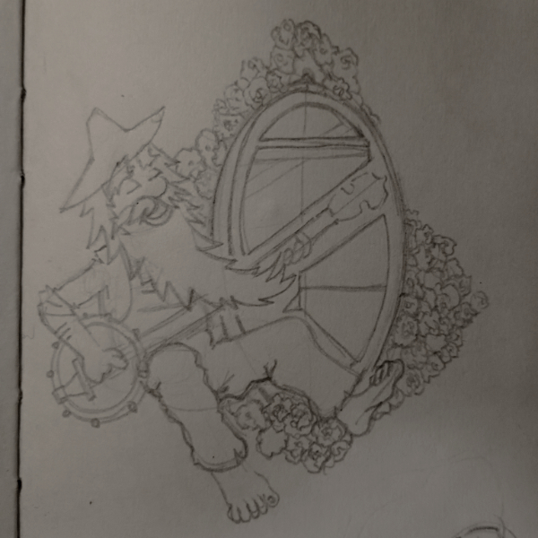
For subjects like this I work in pencil, then scan or photograph, and color digitally in Photoshop. More recently I have moved toward traditional dry media, and digital alternatives to Adobe. A discussion better engaged in a future post.
Why the roses?
Pasadena is famous for it’s annual Rose Parade, and Rose Bowl. There are roses everywhere, even in the city logo. Inclusion of the rose, given a treatment reminiscent of one of the state’s best known bands just works. I sought to replicate the Miller and Kelley roses in a style that matched the cartoon aesthetic of my bearded banjo player.

Why the banjo?
I had the Pasadena Folk Music Society in mind.
Why the long beard and overalls?
Bringing together the historical aspect of California gold mining, the miner aesthetic, and the California tradition of jamming barefoot outside in the sun. I feel this is what you want to reflect promoting an outdoor music festival in a California city at the foot of a mountain.
The official artwork that made use of radial lines depicting sun rays, as well as a giant yellow circle for a sun began to touch on this, but there were problems. For example, the rays could have been centered with the sun as their origin. I don’t think the pink and green were the right choices for the text color. It should be acknowledged they have made improvements of their own over the years.
My version could use some improvement too, now that I look at it again. I tried to give the text the appearance of carved wood grain. Just a little more time on that effect would have been well spent. But, in a way the fast rendering supports the spontaneity, absurdity, and fun of a festival in the city. Since this time period I have watched cartoon characters make a comeback in marketing materials, which is pleasing.