Friday, March 7th, 2025
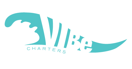
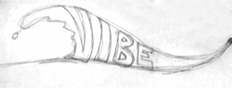
Here is an illustrated wave with original lettering in the negative space that fits in the groove. Designed for a charter company in San Diego. There are many charter lines throughout the world called “vibe”. It’s a popular name. Yet, browsing their brands and marketing work, I find they generally aren’t “vibing”.
Why not?
Their use of cold mechanical typefaces as logos. Fast, cheap, and easy to pick a font, type the name and “ship” it. I don’t think that’s a designer’s job. The job is to actually DESIGN the thing. A logo is one of the highest forms of display text their is and deserves some custom lettering for a major improvement. And the results are more rewarding.