Sunday, March 16th, 2025
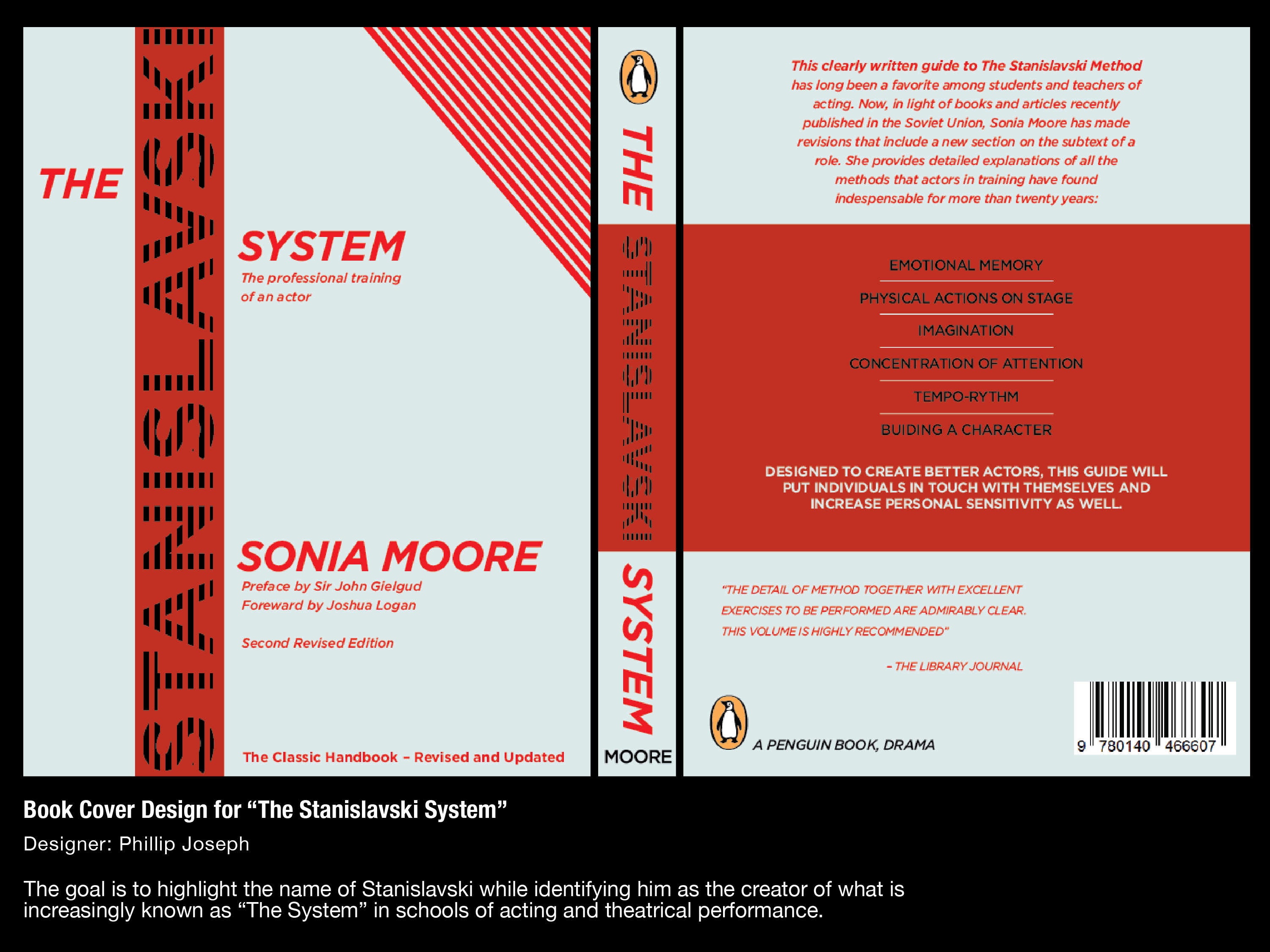
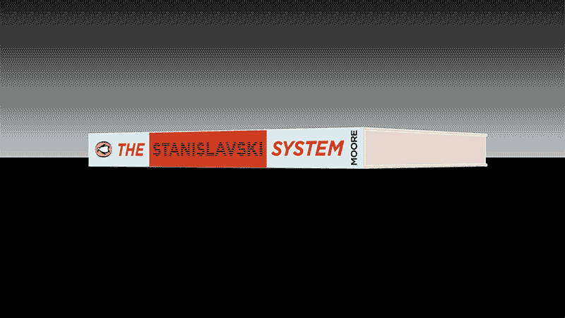
Each textual and graphic element contributes to an understanding and expectation of what’s inside. The concept is further sold with a 3D demo built in blender.
This cover design calls back to the striped covers of plays published by the Dramatist’s Play Service Inc.


Sunday, March 9th, 2025
Right place at the right time.
Sunday, March 9th, 2025
Here is another case study for a Studio Bumper representing “nucleus”. This treatment conveys the crisp attention to detail and meaning symbolized by the unblemished type, which transforms into a single cell–implying the nature of the idea. It incubates inside it’s protective shell until the moment of breakthrough, the birth. That is messy, gooey, nonlinear. What emerges is the complete word. The realization of an idea. It is a metaphor for creativity which is just what nucleus wanted to convey.
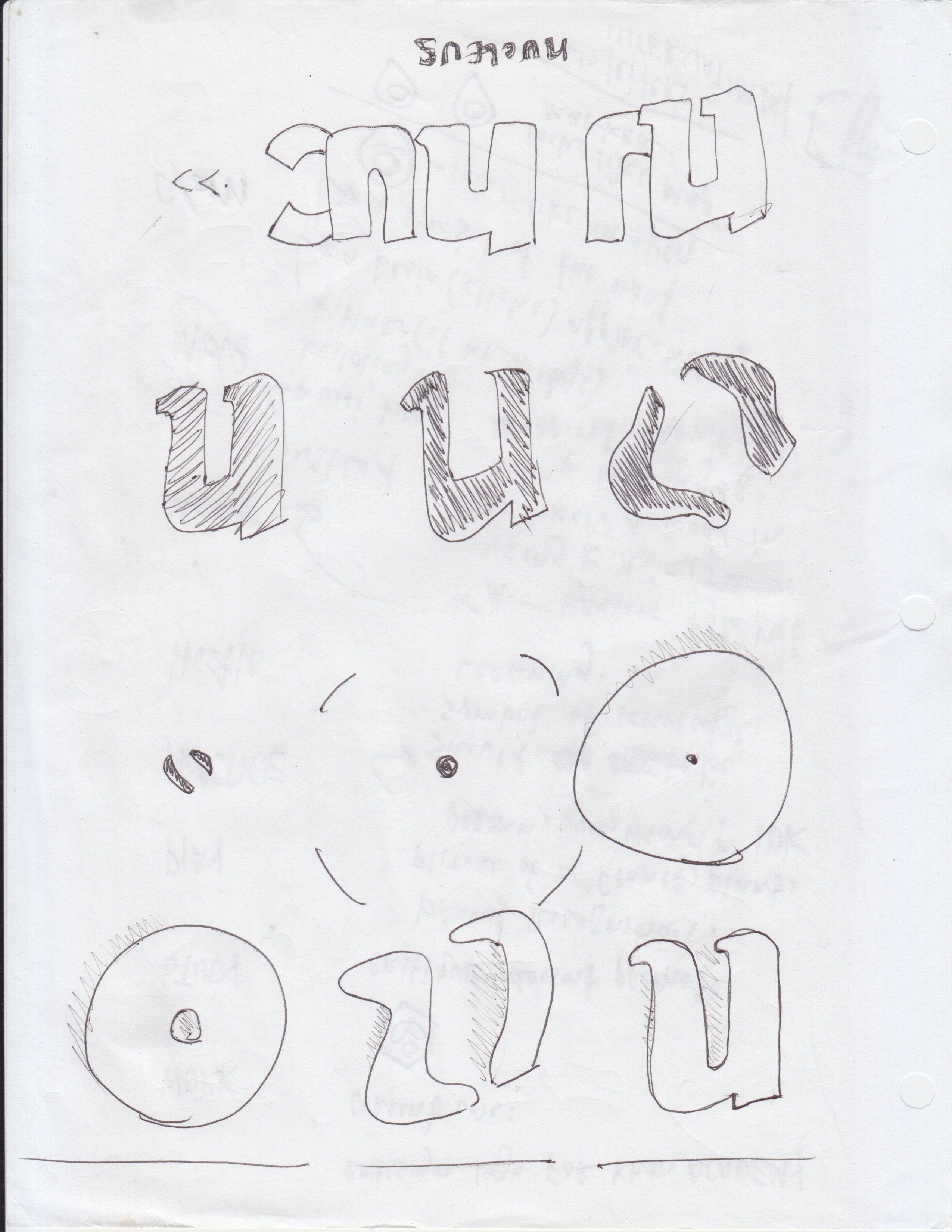
This work began a a series of sketched frames, which were then digitized as individual files. The in-between frames were drawn in vector and placed into a timeline. There are no automated “tweens” except for the Z motion on the word nucleus. Gentle lighting and blur effects are added to give the impression of film projection for a soft, nostalgic feel.
Sunday, March 9th, 2025
I visualize myself contributing to a cinematic work at the level where I get a production bumper credit. Personal pie-in-the-sky. I would temper this egoic display by making it visually appealing in it’s own right, slightly obscuring the declaration while preserving legibility for the interested parties.
It’s a motion-design sample. Simple. No plugins, no AI, just a guy with an Adobe sub.
Friday, March 7th, 2025
In the digital interactive advertising space, we have an element called the “call-to-action”. We explicity state, and suggest, the action that we hope the audience will take as a result of being exposed to the ad.
Hundreds of interactive ads have come across my desk, and I noticed the trend of the CTA becoming merged with the Button–to the extent that we refer to the button as the CTA. Well, I reject the notion that Button and CTA are synonymous.
The call to action is a design element that calls the viewer to action. It doesn’t have to be a button. A call to action can be animated, attractive, it can dance upon the canvas. While a button needs to stay put.
These are call-to action-studies built in Aftereffects, and lovingly converted to GIF. You might be surprised how much push back can come from suggesting the CTA and the Button are not necessarily merged. I guess people can get set in their ways. You’ve heard of “thinking outside the box” and this is no different. Think outside the button!
Friday, March 7th, 2025
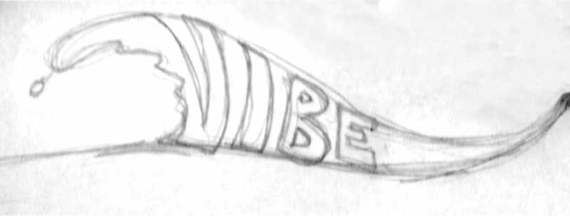
Here is an illustrated wave with original lettering in the negative space that fits in the groove. Designed for a charter company in San Diego. There are many charter lines throughout the world called “vibe”. It’s a popular name. Yet, browsing their brands and marketing work, I find they generally aren’t “vibing”.
Why not?
Their use of cold mechanical typefaces as logos. Fast, cheap, and easy to pick a font, type the name and “ship” it. I don’t think that’s a designer’s job. The job is to actually DESIGN the thing. A logo is one of the highest forms of display text their is and deserves some custom lettering for a major improvement. And the results are more rewarding.
Friday, March 7th, 2025
I created this animation as a promotional piece for Oh Ok Creative. I personally executed on every aspect of this video. The character is hand drawn in pencil, re-drawn in blank ink (a sharpie™ to be exact), then scanned and colored digitally. The limbs and guitar were drawn seperately and placed in separate layers. Each layer is given an anchor point to form a very simple character rig. I recorded the guitar music myself, scheming a riff that would make a suitable 6 second loop, and animated what I have come to refer to as “guitar kid”.
While I don’t consider myself an animator, but a character designer, I believe projects like this open the way to collaboration.
Thursday, March 6th, 2025
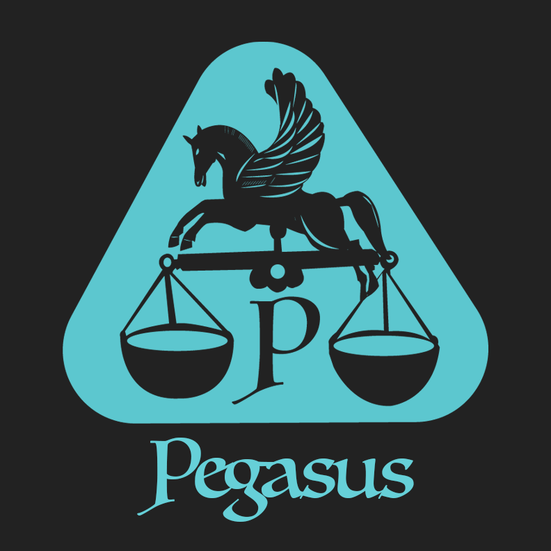
The great Pegasus aloft a pair of scales is a fitting symbol for the power, focus, and energy accessible through the rich and balanced flavor of premium Robusta coffee beans grown and harvested in Greece–the scales themselves symbolizing fair trade and a commitment to unwavering quality.
Thursday, March 6th, 2025
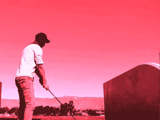
The golfer’s classic gif is another example of executing every step of a project. I filmed myself at a driving range, color edited the video, and selected the best frames for a short gif. The “Golfer’s Classic” is a tournament I hosted and competed in back in 2018. And I won! I was the only participant.
Why did you make this?
After years of working as a production artist, executing on concepts conceived by others, it became clear I needed to self-initiate work I could call my own. It doesn’t matter that the golf tournament is fictitious, the demo is real.
What skill set does this demonstrate?
It takes care and sensitivity to keep an animated GIF to a size that is reasonable for an internet browser to handle. That challenge becomes magnified working with video. You select only the most crucial colors from the file, and delete the rest. The magenta monotone treatment helps, but that was an aesthetic choice. There are still hundreds of slight variations in color that can be eliminated and that is done with intention and care.
It also demonstrates the fundamentals of video editing, file handling, timeline management, and working with video layers in Photoshop.
Thursday, March 6th, 2025
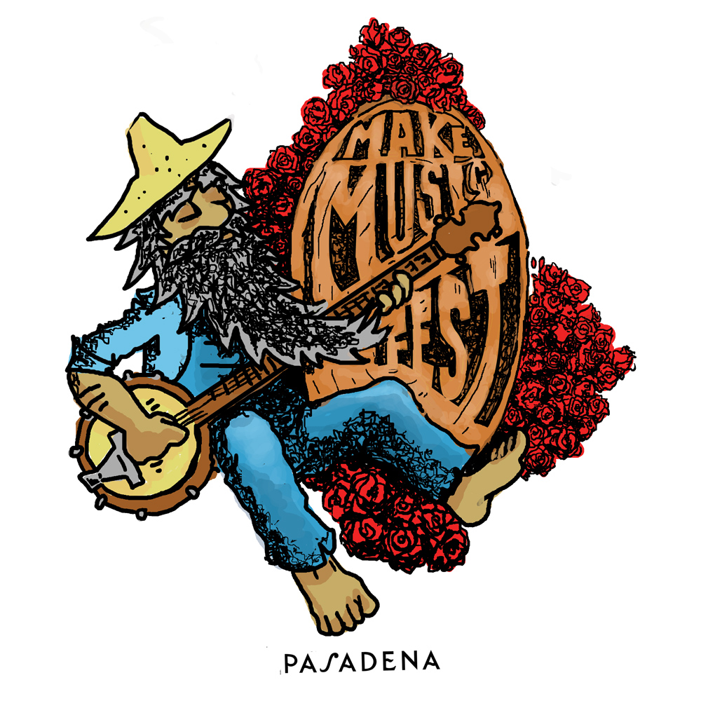
At one point I was moved to re-design marketing and promotion work for entities that I felt deserved better treatment. One such instance was the “Make Music Festival” in Pasadena in 2015. No offense, but even then it was clear that official treatments like the one below were lacking in effort and imagination.

The vibe I would want to contribute to a local California music festival: Something historic, psychedelic, and whimsical. Above all it should be musical. I had adopted the practice of gathering images for what was called in the not-distant past a “mood board”, where you establish a mood to draw from using references. The prevailing images I held in mind were these:
The Grateful Dead’s “skull and roses” logo by Stanley “Mouse” Miller and Alton Kelley.

And this artwork representing the Ancient and Honorable Order of E Clampus Vitas.

The Dead and The Clampers are humorous and I wanted my submission to carry some humor as well.
How did you do it?
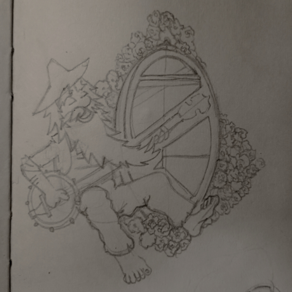
For subjects like this I work in pencil, then scan or photograph, and color digitally in Photoshop. More recently I have moved toward traditional dry media, and digital alternatives to Adobe. A discussion better engaged in a future post.
Why the roses?
Pasadena is famous for it’s annual Rose Parade, and Rose Bowl. There are roses everywhere, even in the city logo. Inclusion of the rose, given a treatment reminiscent of one of the state’s best known bands just works. I sought to replicate the Miller and Kelley roses in a style that matched the cartoon aesthetic of my bearded banjo player.

Why the banjo?
I had the Pasadena Folk Music Society in mind.
Why the long beard and overalls?
Bringing together the historical aspect of California gold mining, the miner aesthetic, and the California tradition of jamming barefoot outside in the sun. I feel this is what you want to reflect promoting an outdoor music festival in a California city at the foot of a mountain.
The official artwork that made use of radial lines depicting sun rays, as well as a giant yellow circle for a sun began to touch on this, but there were problems. For example, the rays could have been centered with the sun as their origin. I don’t think the pink and green were the right choices for the text color. It should be acknowledged they have made improvements of their own over the years.
My version could use some improvement too, now that I look at it again. I tried to give the text the appearance of carved wood grain. Just a little more time on that effect would have been well spent. But, in a way the fast rendering supports the spontaneity, absurdity, and fun of a festival in the city. Since this time period I have watched cartoon characters make a comeback in marketing materials, which is pleasing.